The earliest logo used in advertisements was simply the company name, GREEN RIVER RIFLE WORKS. Subsequent ads combined the last two words into one, RIFLEWORKS, and were used through 1973. The company continued to use the full name as its only logo in advertisements from time to time until it closed in 1980. The name sometimes appears on one line, and sometimes on two lines as below.
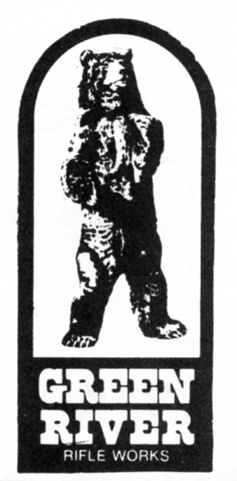
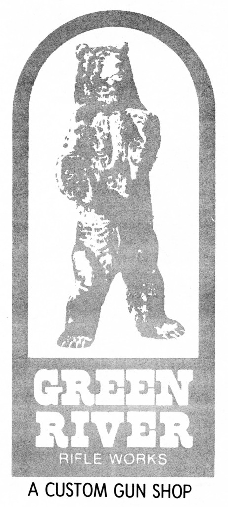
Early in 1974 a new logo appeared in print ads and in their catalog that was shaped like a tombstone with a picture of a standing bear over the words “GREEN” and “RIVER” (each word on a separate line and large block letters), this over the words “RIFLE WORKS” all on one line and smaller case. On the left is the logo used in magazine print ads in 1974 and 1975. On the right is the same logo used on the cover of the 1975 GRRW Catalog.
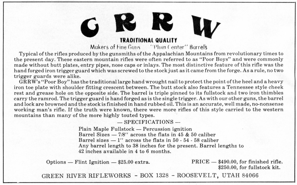
A third logo used has the initials “GRRW” in bold script and a slight arch. The catalog used in 1976 and 1977 incorporated it, and some of their print ads used this logo in 1977, 1978, and 1979. The logo immediately below is from the cover of the 1976 GRRW Catalog.
The advertisement below that is from the May-June, 1977 issue of Muzzleloader magazine.
A variation on this logo is found on the warranty sheet and loading, cleaning instructions that were sent out with each factory rifle and kit in the late 1970’s. Like the earlier logo, it has the letters “GRRW” in an arch, but the font is bold block letters.
We could not find any print ads or other print material other than the instruction sheets with this logo. A barrel stamp in similar block letters was used to mark the breech end of barrels that were sold individually.
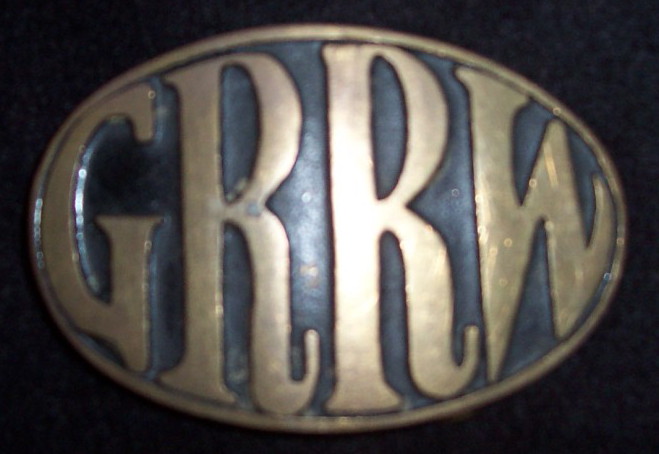
The fifth and final logo has the initials “GRRW” in an oval. This design was used on their last catalog, from late 1977 until they closed. The image was also made into a belt buckle. Today, this is the most recognizable of the GRRW logos, but interestingly, we could not find its use in any print ads.

